- b2evolution CMS User Manual
- Back-office Reference
- Collections
- Settings
- Item types
- Item Type form
- Item Type: Custom Fields Panel
Item Type: Custom Fields Panel
This panel lets you define Custom Fields for the current Item Type.
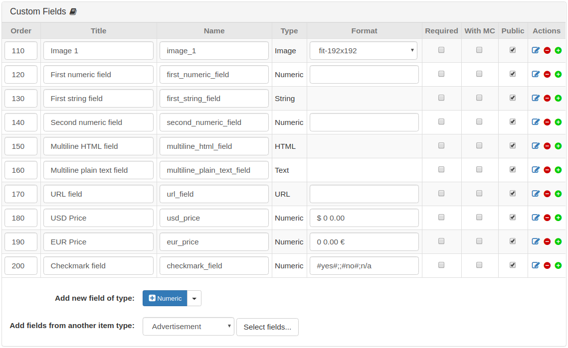
The different columns also appear in the "details" form which you can open with the "edit" icon for each field. Please see below for an explanation of these details.
Adding/Defining New Custom Fields
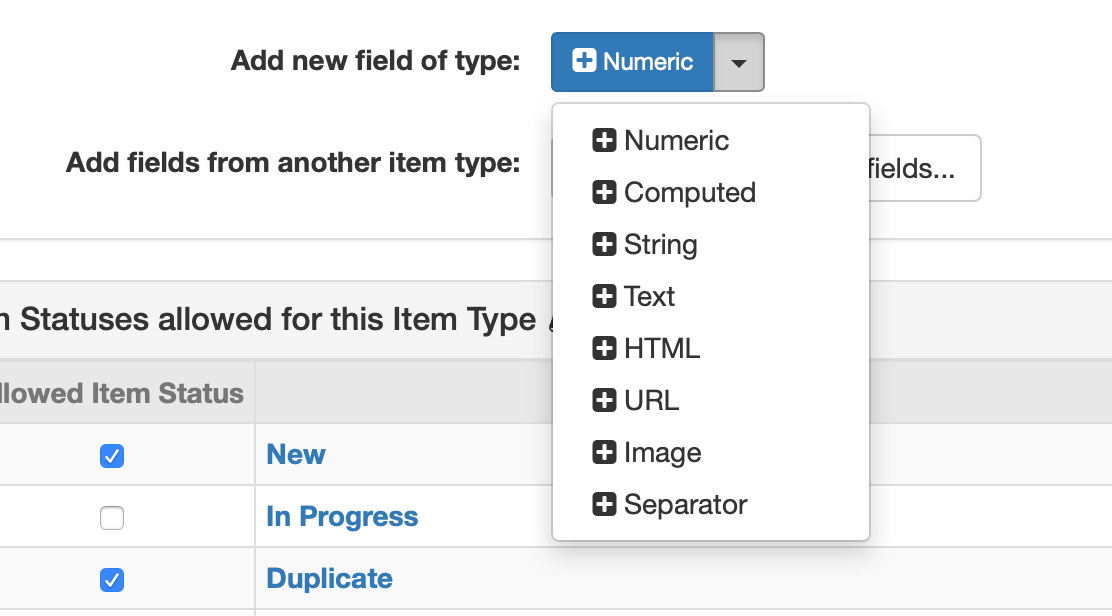
You can define custom fields of the following types:
- Numeric: Useful for Price, Weight, Length, etc. This field will be stored as a double floating-point number.
- Computed : The value will be computed with formula from other Numeric or computed fields. See the Formula field below.
- String: Useful for text strings such as Brand, Color, Fabric, etc. This field will be stored as a varchar() field.
- Text: Useful when you need multiple lines of text
- HTML: Useful when you need (multiple lines of) text including formatting.
- URL: Useful for URLs that will be clickable (potentially in the form of a button).
- Image: Useful to reference an image (but its Link ID) to have it appear in a specific place of a template or to have it appear in comparison tables.
- Separator: This is useful to group several custom fields under a heading that will separate groups of fields, for example in comparison tables.
Custom fields from another item type can also be added. Select the item type from which to import the custom type in the Add fields from another item type field then click on the Select fields… button. This will show a pop-up window listing the available custom fields from the selected item type.
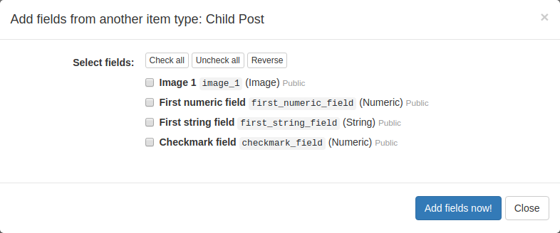
Check all the custom fields that you want to add and click on the Add fields now! button to finish the process.
Custom Field Details
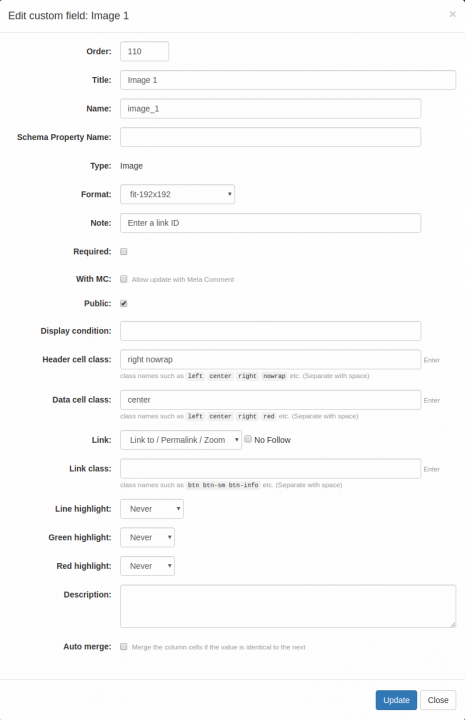
You can open the following pop-up/modal dialog by clicking the "edit" icon for a specific field:
Custom field with type "Computed" has an additional option "Formula":
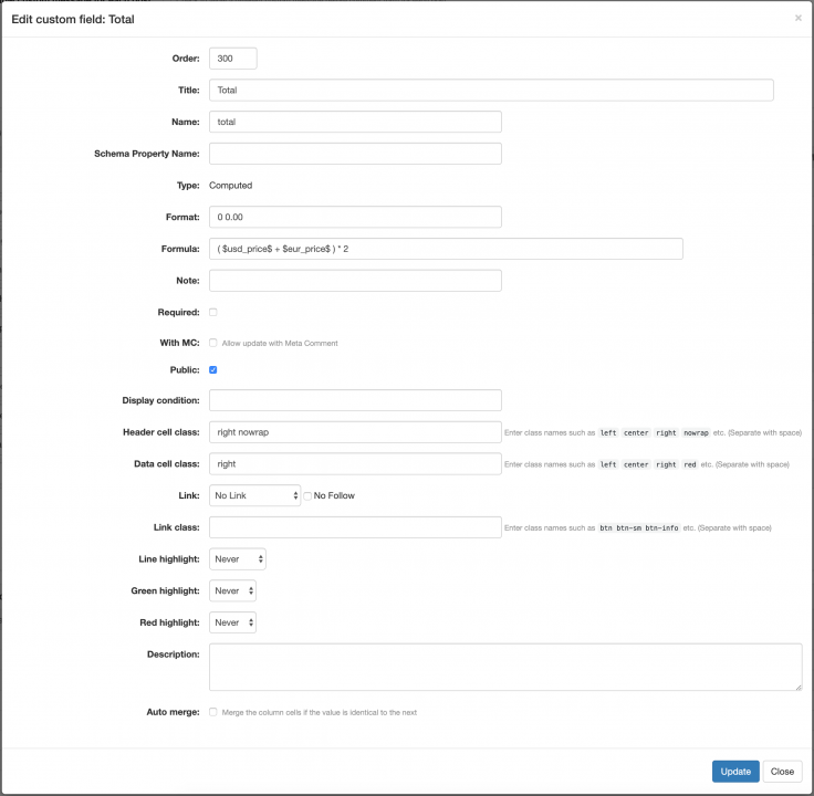
- Order: the order of the field relative to the others. Useful to order field in the back and/or front-office.
- Title (sometimes also called Field Label): the label that will be displayed to name the field
- Name (sometimes also called Field Code): the internal code you will need to use to designate specific fields to display in a widget, in a short tag or in PHP code
- Schema Property Name: Use this if you want the custom field to be used as a semantic markup in the generated web pages.
- Type: see above. The type of a field cannot be changed after creation.
- Format: allows to format the output of numeric fields:
- Simple format example: with format
$ 0 0.00, the value12345.6789will be displayed as$ 12 345.67. - Complex format: different formats can be specified for positive number, negative number, zero, empty field and special values. Each format will be separated by
;.- Complex format example for a "Cancel within…" field:
00 days;;#no# Not available;;9999=Anytime! - The 5th and next formats can be used to specify custom values like
123=textthen custom field value123will be replaced withtext.
- Complex format example for a "Cancel within…" field:
- More examples:
00$=>12346$$00.0=>$12346.700.0=>12345.70 0.0=>12 345.70'0.0=>12'345.7000.000,0000000=>12.345,67890000,0=>12345,70.0=>12345.70 0,00=>12 345,680 0.00=>12 345.680 0=>12 3460′0=>12′3460.0,00=>12.345,680,0.00=>12,345.680.0,=>12.3460,0.=>12,346
- You can add CSS classes with
[.classname]- Example for positive numbers in green and negative numbers in red:
0 0.0[.green];0 0.0[.red]
- Example for positive numbers in green and negative numbers in red:
- Possible masks in formats:
#yes#or(yes)- green check icon#no#or(no)- red cross icon(+)- green plus sign in circle(-)- red minus sign in circle(!)- orange exclamation sign in triangle||- new line| |- space{note_sample_text}-<span class="note">note_sample_text</span>#stars/5#- 5 yellow stars#stars:2.3/5#- 2.3 of 5 stars
- For field type "Separator", you can specify a format like
repeat:company_logowhich means you want to repeat the pre-exising fieldcompany_logobelow the separator.
- Simple format example: with format
- Formula: this is where you enter a formula for computed fields.
- Example:
$prep_time$+$cook_time$+$passive_time$will produce the SUM of the fields having the codesprep_timecook_time&passive_time. - IMPORTANT NOTES:
- The results of the formula are computed on post save (and will trickle down to child posts when needed). If you change a formula you need to re-save the posts that use it in order to see the changes.
- NULL values/empty fields will be considered as
0in the computation. If this leads to unwanted results, you may be able to hide the result with the Format string.
- Example:
- Note: displayed in the back-office.
- Required: check to indicate that this custom field is required.
- With MC: check to include this custom field in the meta-comment form. This custom field can be updated at the same time when a meta-comment is created.
- Public: if not checked, the field will be shown only in the back-office.
- Display condition: this lets you specify conditions (based on the URL parameters) when the field should be displayed.
- For example, if you specify
cur=eurohere, the field will only be displayed if a URL parametercurhas a value ofeuro. - A field can be displayed for several cases, for example
details=std|full - A field can also be restricted by multiple conditions, for example
details=std|full&cur=euro
- For example, if you specify
- Header cell class: CSS class names used to style the Title/Label of each line with the widget and short tags that display in table format.
- Data cell class: CSS class names used to style the value cells in tables (see "Header cell class" above).
- Link: should the value be displayed as a link? This is useful for URL custom fields but also other types of fields can link to the permalink of the Item or the "Link to" Url of the item.
- Link class: CSS class to style the
<a href=...>tag. - Line highlight: useful in comparison tables, to highlight the lines that have differences between the compared items.
- Green highlight: useful in comparison tables, to highlight the cells with the lowest/highest value.
- Red highlight: useful in comparison tables, to highlight the cells with the highest/lowest value.
- Description: will appear in a tooltip.
- Auto merge: if checked, multiple columns with the same value will be merged. It can be used to display tables with less redundant info.

