9 comments
Comment from: Sérgio Lima
Comment from: fplanque

Thank you.
I don’t know the specifics of the epub format but maybe it could be handled as a custom skin… ?
Comment from: MaxHedrm
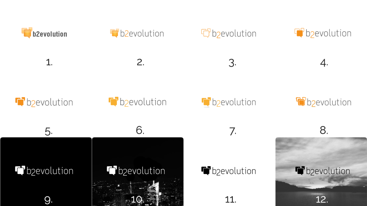
I vote for #2, especially the text. Then the speech bubble from number 2 or the outlines from #3 based on where it is used.
Comment from: fplanque

Thanks. Any particular reason for the text of #2?
Comment from: ednong

Uh, logo.
First orf all: what you intent with the logo? At the moment I only think, the font/the word is ok - the bubbles never would look like a thing to show “This is a blog application".
So, the font should be a little bit moderner like 2-8 or with another mondern font. But the bubbles - hm - I don’t know a good icon for the word “blog".
No 9 - 12 is unusable - I get a connection to windows with this pics. And that is not the thing you should intend.
Comment from: fplanque

Can I be a bit snarky for a second? ;)
Only the small bubble in the logo stands for “blog". b2evolution is much more than a blog engine now! :p
Ok, more seriously now: one meaning of the bubbles is the idea of a discussion between the site and its audience or between the community members themselves.

Comment from: ednong

May be No 2 without the subscripted 2 - and it should a little bit bolder, the font. That would great.
Comment from: fplanque

Interesting. Why not the subscript? From all the answers we got through different channels, some people have explained why the like the subscript ("it looks scientific") but nobody has explained why they don’t like it yet… (although you’re not the first to not like it).
Actually we got many many conflicting votes and there is no clear winner. This is why it’s very interesting to hear the “why” of every choice.
Thank you.
Comment from: MaxHedrm
For me, the non-subscripted 2 is cleaner. It also means that your logo type doesn’t have to be a graphic. The subscript seems a bit gimicky.


Wow,
Congratulation for best work in B2evolution 6.x.x. I am running 6.4.3 and all is fine! About Logo 9, 10, 11 and 12 I dislike! Black and white is not good logo!
5 ad 8 are best logos. why? I don’t know :-) I just like!
A feature that would like so much in b2evolution is export post (filtered for user) in epub files. Is not a crucial feature, but will be cool.
Anyway, congratulation again for the best CMS + blogging tool ever :-)