

For clarity, we will talk only about width in the following text. Consider the height of the images to follow proportionally.
When an <img src="image.jpg"> is displayed, that image.jpg is loaded from the server with specific pixel dimensions.
But in reality, the image will be resized to different pixels dimensions by the skin, especially by the Bootstrap CSS layout. So for different screen widths we actually need different image sizes.
Determining sizes
"Small" screen
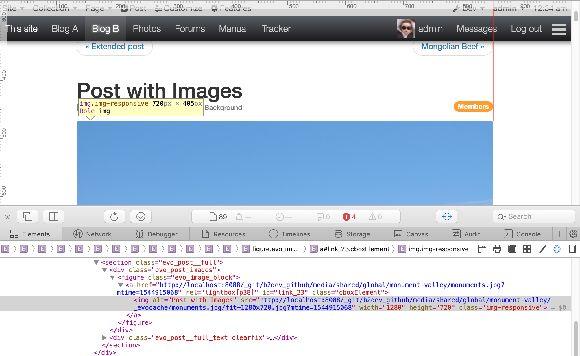
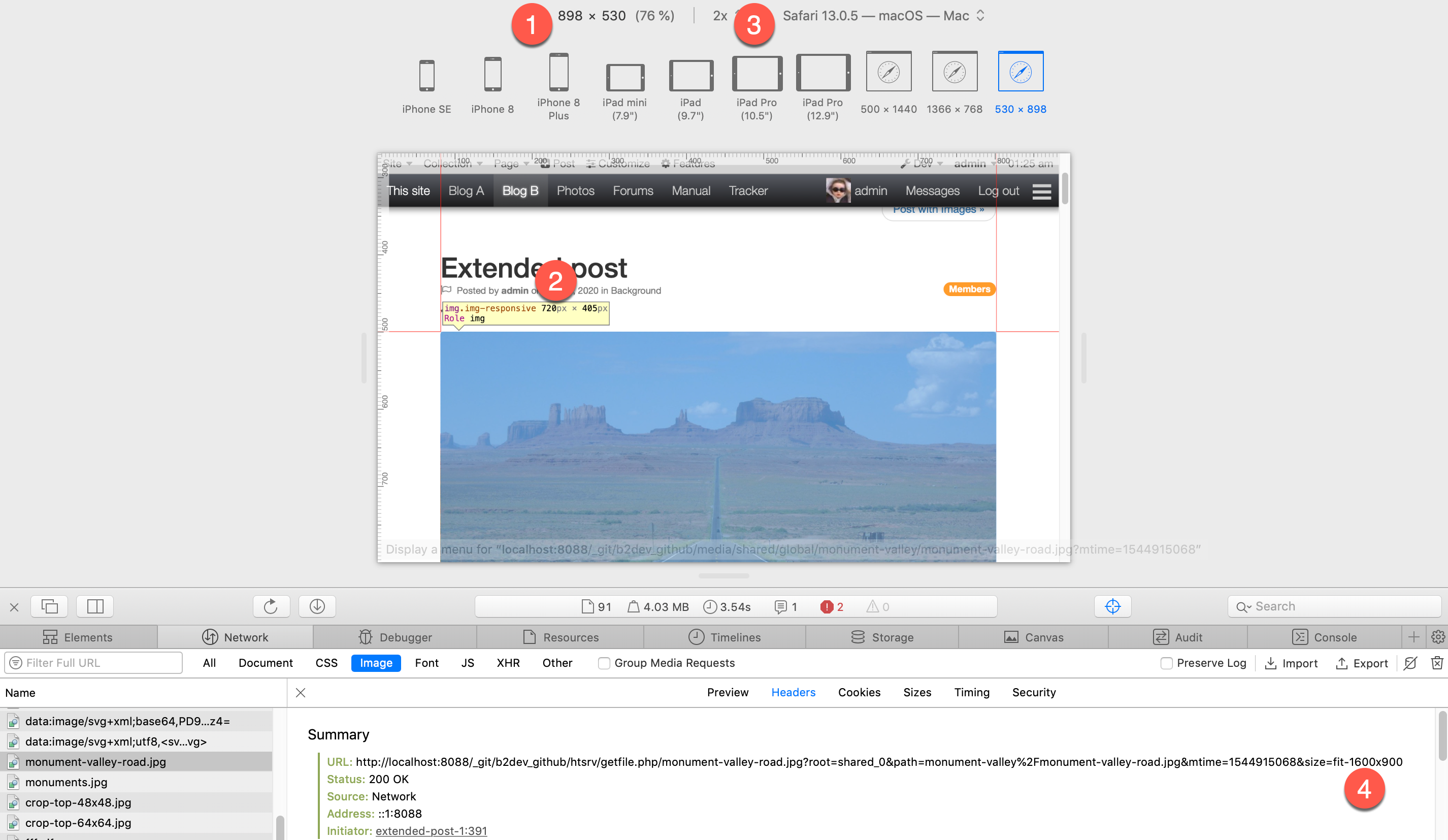
At sm viewport size, this image occupies 720 px in width:
"Medium" screen
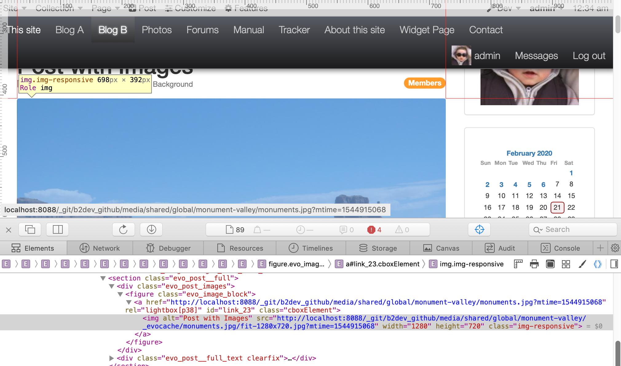
At md viewport size, this image occupies 698 px in width: (it is less than on sm screen because a sidebar has been added at this viewport size):
"Large" screen
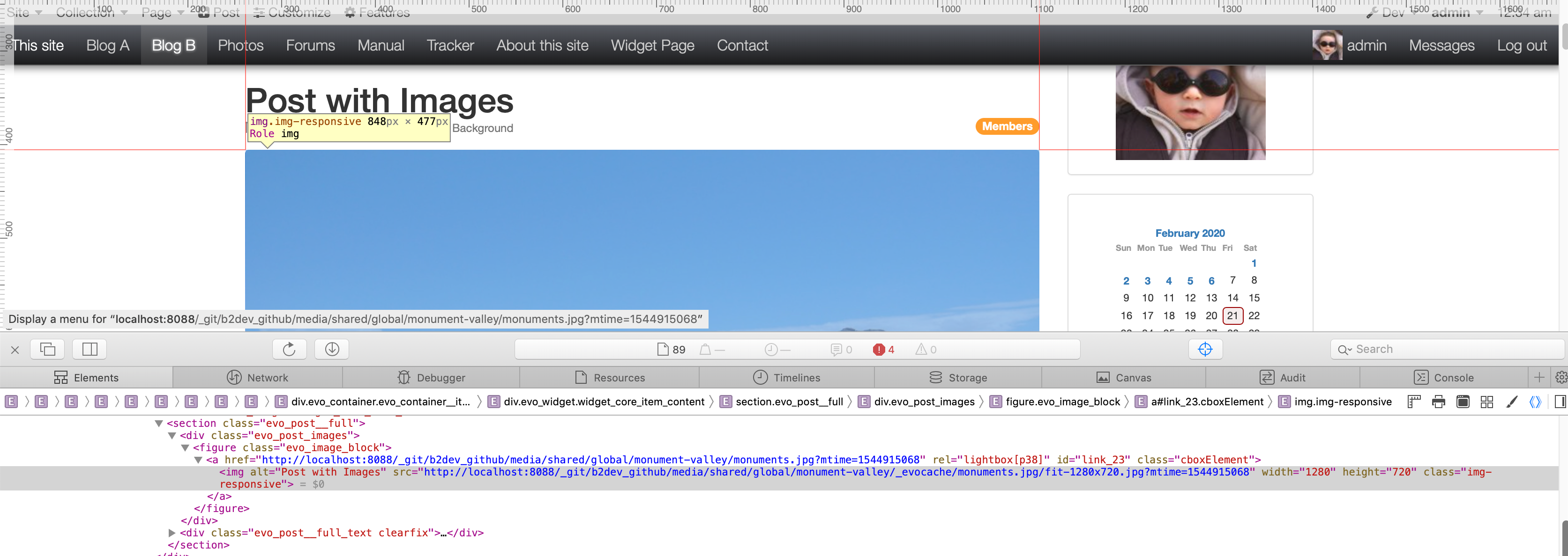
At lg viewport size, this image occupies 848 px in width:
Summary of sizes
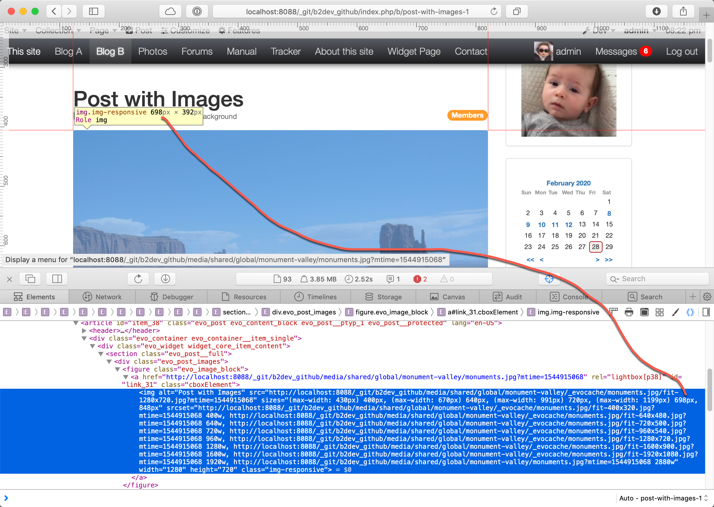
Once we have looked at all possible sizes, we come up with the "perfect" <img sizes="...> attribute:
// Note: first we handle margins 15+640+15 = 670 in the fluid domain, then we work with bootstrap breakpoints:
  sizes="(max-width: 430px) 400px,  // Page width = fluid               : 2 x 15px margin (there is no breakpoint, but we add this for optimizing image size on very small screens...)
         (max-width: 670px) 640px,  // Page width = fluid               : 2 x 15px margin (... 400px and 640px are existing thumbnail sizes in B2evo; we just add 2x15px margins)
         (max-width: 991px) 720px,  // Page width = Bootstrap sm Small  : fixed width, fluid margin
         (max-width: 1199px) 698px, // Page width = Bootstrap md Medium : fixed width, sidebar, fluid margin
                             848px" // Page width = Bootstrap lg Large  : fixed width, sidebar, fluid margin
Determining srcset
The above tells the browser which size we are going to need for optimal display…but it does not mean those exact sizes are available on the server.
Therefore b2evolution will generate a srcset attribute with all possible sizes starting at the smallest we may need, and then all bigger ones available:
srcset="fit-400x320.jpg 400w,
          fit-640x480.jpg 640w,
          fit-720x500.jpg 720w,
          fit-960x540.jpg 960w,
          fit-1280x720.jpg 1280w,
          fit-1600x900.jpg 1600w,
          fit-1920x1080.jpg 1920w,
          original-2880px-file.jpg 2880w"
The full responsive img tag looks like this:
How it is used
- Let’s suppose the wiewport is 950px wide.
- In this case
sizes=tells the browser we are going to display the img at 720px wide - So the browser would look into srcset and find
fit-720x500.jpgas the best match.
HDPI
The above gets more complex with HDPI screens.
- Let’s now suppose our screen is a 2X Retina screen.
- In this case we need a 720 * 2 = 1440 px wide image.
- So the browser would look up the best match and find
fit-1600x900.jpg 1600w.
And this is indeed the file that will be loaded in this case:
Summary of img tag generated:
<img
  src="fit-1280x720.jpg" width="1080" height="720" class="img-responsive"

  // Specify the (normal) width the image (teaserimage here in disp=single) will use depending on media/page width (this takes into account margins, but may be approximate if sidebars are optional)
  // These sizes depend on the responsive skin layout can be measured with the Inspector or even a screenshot tool.
  // Note: first we handle margins 15+640+15 = 670 in the fluid domain, then we work with bootstrap breakpoints:
  sizes="(max-width: 430px) 400px,  // Page width = fluid               : 2 x 15px margin (there is no breakpoint, but we add this for optimizing image size on very small screens...)
         (max-width: 670px) 640px,  // Page width = fluid               : 2 x 15px margin (... 400px and 640px are existing thumbnail sizes in B2evo; we just add 2x15px margins)
         (max-width: 991px) 720px,  // Page width = Bootstrap sm Small  : fixed width, fluid margin
         (max-width: 1199px) 698px, // Page width = Bootstrap md Medium : fixed width, sidebar, fluid margin
                             848px" // Page width = Bootstrap lg Large  : fixed width, sidebar, fluid margin

  // Now we send all available sizes + the width of that size. The browser will auto select based on srcset and if screen is Retina/HDPI or not.
  // For example: page width = 900 -> image will display at 720px but we have a Retian 2X display, so we need 1440 px -> browser will select the image for 1600w.
  srcset="fit-400x320.jpg 400w,
          fit-640x480.jpg 640w,
          fit-720x500.jpg 720w,
          fit-960x540.jpg 960w,
          fit-1280x720.jpg 1280w,
          fit-1600x900.jpg 1600w,
          fit-1920x1080.jpg 1920w,
          original-2880px-file.jpg 2880w"
 >
Another example
<img
  src="fit-1280x720" width="1016" height="208" class="img-responsive"  // This is a smaller image...

  // ... but the target placement is still the same (teaser image in disp=single)
  // These sizes depend on the responsive skin layout can be measured with the Inspector or even a screenshot tool:
  sizes="(max-width: 430px) 400px,  // Page width = fluid               : 2 x 15px margin (there is no breakpoint, but we add this for optimizing image size on very small screens)
          (max-width: 670px) 640px,  // Page width = fluid               : 2 x 15px margin
          (max-width: 991px) 720px,  // Page width = Bootstrap sm Small  : fixed width, fluid margin
          (max-width: 1199px) 698px, // Page width = Bootstrap md Medium : fixed width, sidebar, fluid margin
                              848px" // Page width = Bootstrap lg Large  : fixed width, sidebar, fluid margin

  srcset="fit-400x320 400w,
           fit-640x480 640w,
           fit-720x500 720w,
           fit-960x540 960w,
           original-1016px-file.png 1016w"
>
Example of tiles in a "tiled list" widget template:
[set:evo_tile_image_sizes=(max-width: 430px) 400px, (max-width: 670px) 640px, (max-width: 767px) 720px, (max-width: 991px) 345px, (max-width: 1199px) 334px, (max-width: 1799px) 262px, 400px]
Here we made 2 optimizations:
(max-width: 767px) 720px: it could grow fluid to 767-30 = 737px, but we’d rather stick to size just below and get a little upsize if user is between 721 and 737- above 1800px, we have either 360px if using a 3 col layout or 458px if using a 2 col layout. We compromise on 400px because it’s a standard size in b2evolution and the most likely is we will need 360px.
- We could make more precise templates depending on the page col layout
Reminder about Bootstrap breakpoints:
- Small devices (landscape phones: 576px and up)
@media (min-width: 576px) { ... } - Medium devices (tablets, 768px and up)
@media (min-width: 768px) { ... } - Large devices (desktops, 992px and up)
@media (min-width: 992px) { ... } - Extra large devices (large desktops, 1200px and up)
@media (min-width: 1200px) { ... }