13 comments
Comment from: tilqicom

Comment from: Gary
Hello ther B2Evolution team,
Thank you for the update to 5.0.7. About your webpage - I do like the minimalistic look of the new site. Try to make it so we don’t have to scroll on a normal screen to see the full homepage. Consider adding a slider with screen shots of userser blogs or theme screen shots.
Also - time for a new skin - try putting mystique
B2Evolution - “The relentless evolution of personal publishing”
Comment from: fplanque

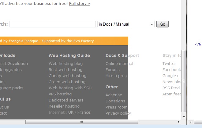
@tilqicom Some sites have a footer like this on all pages, others on the homepage only. We’re having a hard time deciding which is best… Any thoughts?
Comment from: fplanque

@Gary We are actually on a trend of using bigger fonts (because text is intended to be read), thus using more space, thus not trying to cram as much as possible into one screen / above the fold.
A slider is definitely coming… and it will show Mystique among others.
Comment from: tilqicom

Personally I opt to include footer in all pages since it doesnt waste any vertical space above the fold
On the other hand some kind of “quick menu” could come handy. Scrolling back to top to access other pages is kind of hard for the average user. Even more so if they want to go to a sub-page - Extend > Skins etc.
A fixed design is just fine I think, no need to hop on the responsive train, but a select menu for smaller resolutions would do good for mobile users.
PS: The footer is looking odd - I thought it was the floats not clearing but it seems to be something else.

Comment from: fplanque

@tilqicom : can you please recheck the footer issue now? I added a min-width (to the header too - homepage only for now.)
What do you mean with the quick menu? What’s the difference with the (grey) footer menu?
Comment from: ednong
Hi,
I think to have the search field in the top would better than at the bottom. And I miss the feets of the b2evo-user-blogs. twitter is nice, but the other should be there too.
Comment from: fplanque

Hi @ednong,
Agreed on the search field. We’ll put it back at the top in the final design.
Regarding the list of user blogs, it was giving visibility to the bloggers who posted the most posts per week. Also many times the destination blog would be in a different language and visitors wouldn’t undos tans it. Here we are giving visibility to the people who publicly said something nice about b2evolution. It’s a very different purpose.
Am I making sense?
Comment from: tilqicom

Yup, the footer is all good now.
“What do you mean with the quick menu? Whats the difference with the (grey) footer menu?”
Not much, the footer menu pretty much has all the common links, the problem is that it’s “footer menu” :) 1- It’s way down the page, makes it harder for the average user to access / even notice it. 2- It’s only visible on homepage right now.
A menu visible (or at least accessible) at all times would be useful IMO.
A fixed left hand vertical menu, a collapsible toggle menu or a flyout menu activated with click - hover, or a select menu.
But a fixed menu visible at all times is hard to find a good place for. Instead of that It’d be better if that menu came on demand. Ie. you know how “scroll to top” button appears in bottom right hand corner when you go below the fold ? Now think that it’s not on bottom right but on top left corner, and when you hover - click on it the menu pops out
Comment from: ednong
Hm,
is a blog not a place where I said sth nice about b2evo publicly?
On the homepage of b2evo I only can see 4 ppls on twitter. Is that the only place for publicly saying?
Comment from: fplanque

@ednong Of course you are right that blogs are possible places for saying nice things… including abut b2evolution :)
What I meant was that the automated list of all blogs was promoting heavy volume blogs no matter what they wrote on them, in what language it was and whether or not it was relevant to other b2evo users.
The tweets are easy for us to read them all because they are short and they are easy to quote… also because they are short ;)
But we’ll be happy to post a nice quote from you from wherever you want to post it. Be sure to let us know so we can find it ;)
Also the current homepage prototype only quotes a few tweets but we will definitely extend this to more sources.
Comment from: fplanque

@tilqicom ah ok. Our plan was to have a small fixed menu staying at the top, similar to what is already implemented in the forums (we’re still in the process of getting everything on the exact same CSS)
Comment from: fplanque

@tilqicom Ok, we now have the fixed menu as well as the grey footer on a growing number of pages (the conversion of the entire site is still in progress).


I almost never go to the homepage but gotta say, the footer’s looking good